Reading time ~6 minutes
Redesigning CloudSecList with Claude Design
- Why a redesign now
- Phase 1: Getting a mockup
- Phase 2: From mockup to code
- Phase 3: What about the rest of the website?
- What didn’t get faster
- Conclusions
CloudSecList just shipped a redesigned landing page.
Claude Design did the mockups. Claude Code wrote most of the code for Jekyll. I did everything in between, which turned out to be most of the actual work.
If you are curious, let’s start with a quick before/after comparison:
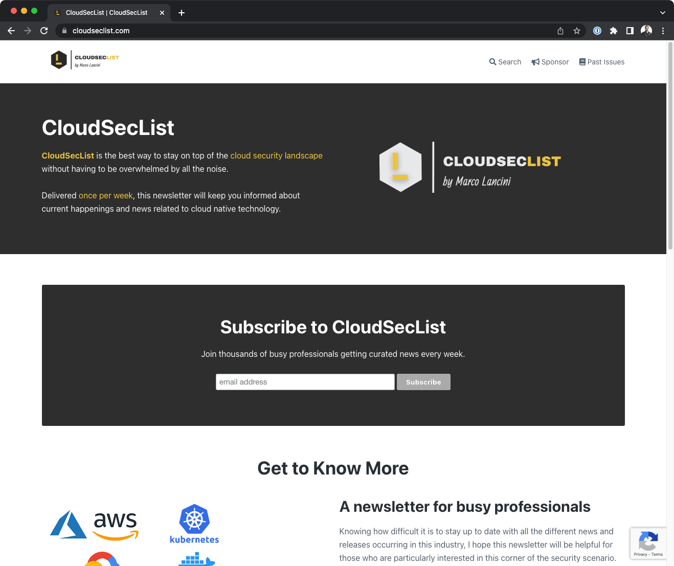
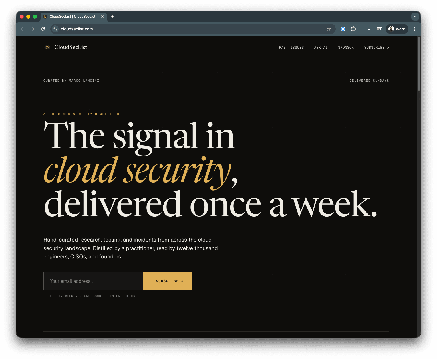
Claude Design was genuinely impressive at producing the mockup. The hard parts (knowing what looks right for the brand, getting generated code production-ready, and writing copy that sounds like me) didn’t get any faster. If anything, they got more visible.
Why a redesign now
Aside from a quick refresh in 2021, the CloudSecList landing hasn’t seen a serious upgrade since I first put it up.
It worked, but it looked like what it was: a personal project that grew past its starting template. The audience got bigger, the sponsor mix changed, the brand around the newsletter tightened up, and the gap between the site and the rest of the operation was hard to ignore.
I had two options. Hire a designer and a frontend developer for what is, generously, a small static site. Or use Claude for both, with me as the editor.
Since Anthropic had just released Claude Design, this was a perfect reason to test it on something real.
The constraint was time. I gave myself a weekend, expecting either to ship something or to learn that the workflow had a ceiling I couldn’t push through. What I underestimated was how much work would still be left after Claude was done.
Phase 1: Getting a mockup
OK, so I told myself: let’s figure out how good Claude Design actually is. Maybe it’s so bad it isn’t worth the time investment.
Oh I was so wrong.
I basically started by uploading the source of the current static site and asked:
Attached is my current website for CloudSecList. Can you see it? How can we make it more modern and slick?
Notice how little effort I even put into the prompt. I genuinely thought I’d do a quick pass and drop the experiment.
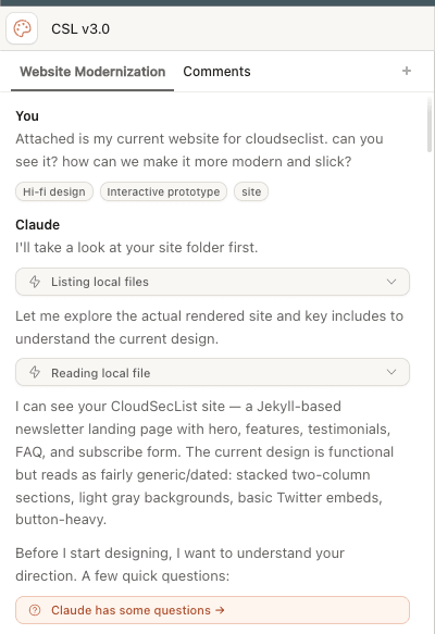
Instead, after a quick analysis, a semi-harsh critique of the existing style, and a few follow-up questions, it did produce an impressive mockup:
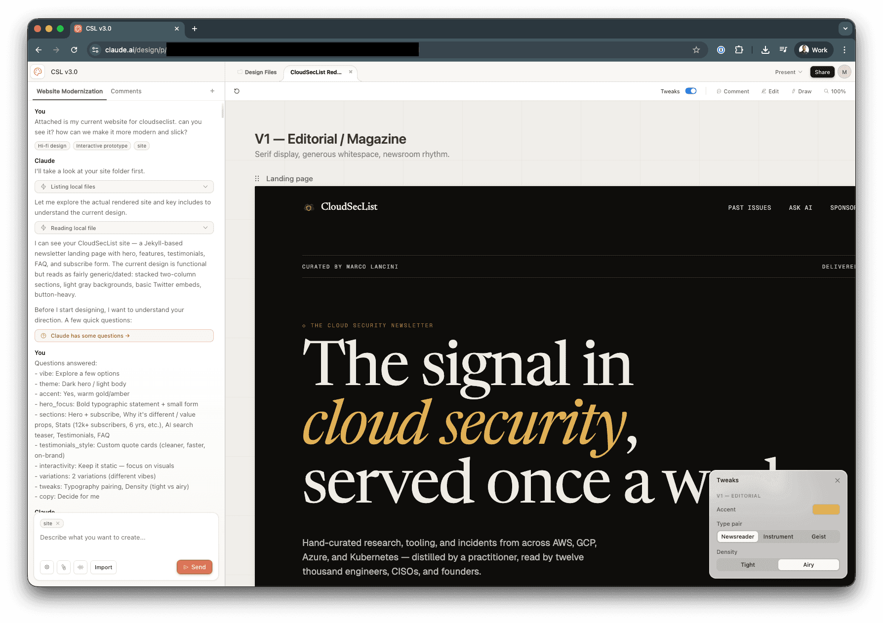
The first pass came back as a full landing page: hero, stats, features, topics, AI section, testimonials, FAQ, CTA. The structure was close to what eventually shipped. Claude has clearly seen enough good landing pages to assemble a passable skeleton without much help.
Phase 2: From mockup to code
By this point I was too invested to drop the experiment, but wary of the amount of work needed to somehow “export” that beautiful mockup into something usable.
Conveniently enough, Claude Design had created a port folder that actually resembled the original source I’d provided.
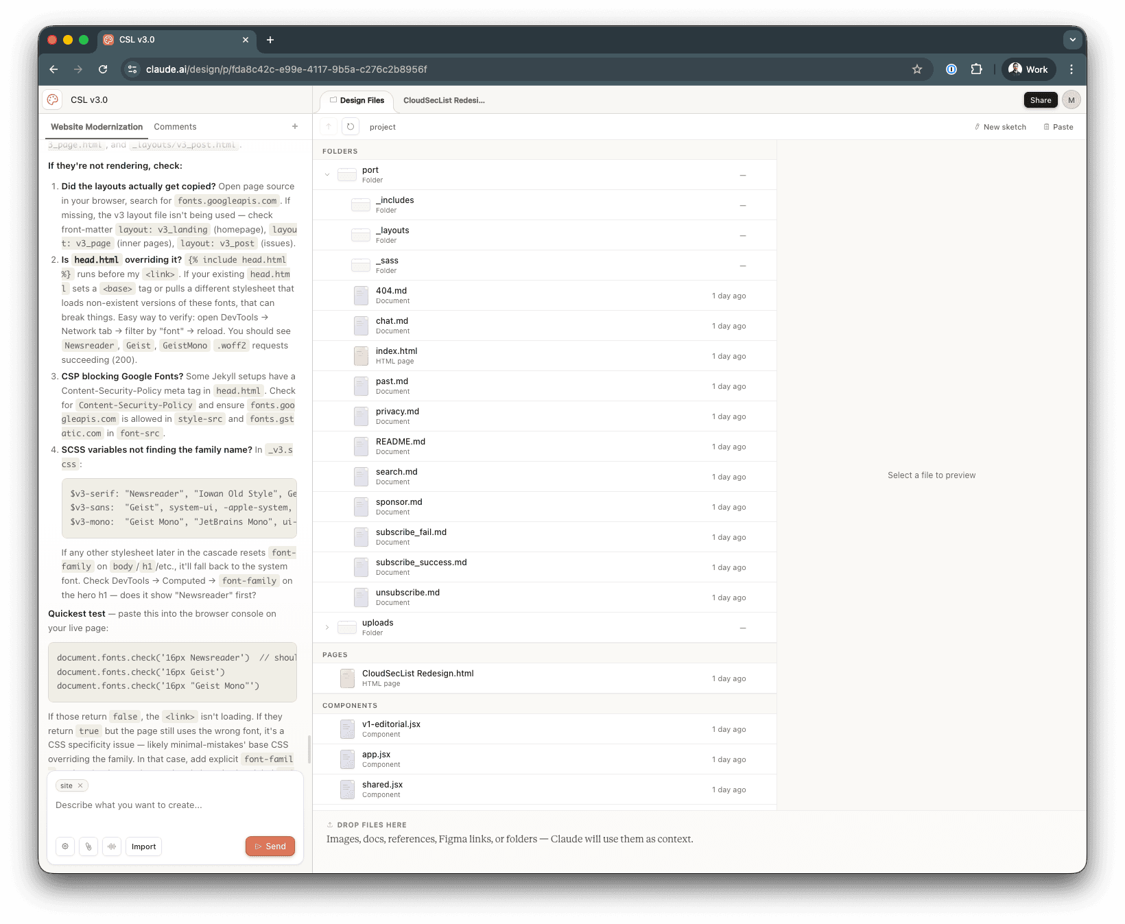
I set up a temp folder in my monorepo and, to my surprise, it compiled straight away. The first pass got me to roughly 90% of the redesign, rendered as a working Jekyll site.
Phase 3: What about the rest of the website?
That 90% number is worth pausing on. It’s high enough that the workflow feels almost magical the first time you see it. It’s also low enough that the remaining 10% is where every problem worth solving lives. (Mocking up a hero block is easy. Getting it to align with real content underneath, render correctly with real assets, behave on a phone, and match the brand voice is the actual job.)
Once I had a mockup I was happy with, I handed it to Claude Code.
The git log tells the actual story: between the first commit on the new layout and the one that triggered the production redeploy, there were about 40 work-in-progress commits over a 12-hour stretch.
A non-exhaustive list of what I had to fix:
- Only the index page was done. What about the other pages? Claude Code was smart enough, with some prompring and references, to apply the new style to the rest of the site.
- Mobile CSS broke at launch. Desktop looked clean. Mobile didn’t. The hero collapsed in the wrong direction, the feature grid wrapped into something illegible, the testimonial cards overflowed their container.
- Spacing was off in aggregate. Each section was fine on its own. Together they didn’t have a consistent rhythm. Some sections were packed too tight, others ran into their neighbours. Claude composes locally; it doesn’t see the whole page.
- Asset paths assumed a directory layout that didn’t exist. Generated references pointed at folders the project didn’t have. Easy to fix once you saw it, difficult to catch without actually loading the page.
None of these issues would have been caught from the mockup, and most of them only show up once you’re staring at the deployed page. Individually they’re small, but they add up to the difference between a site that looks right in a browser tab and one I’m willing to put my name on.
This is the part of the workflow that gets the least attention in posts about AI redesign work, and it’s where most of the time went.
What didn’t get faster
Three bottlenecks didn’t get cheaper, nor faster:
- Taste. Knowing what to reject is the design-side bottleneck. The model produces variants forever. Deciding which one is right for the brand is up to you. Most of the time I spent in the mockup phase wasn’t writing prompts. It was looking at output and saying no.
- Production hardening. The gap between looks right in a mockup and holds up on a real device with real content isn’t getting smaller. The model writes the easy code. The hard code is still hard, and it’s still mine.
- Copy. The model produces plausible words at infinite scale. It doesn’t produce words that sound like me, because the words that sound like me aren’t in the training data. It doesn’t mean that the model’s defaults aren’t bad in any objective way. They’re just generic, which is the same problem in a different shape. Generic copy is what makes AI-built landing pages identifiable from across the room: the same headline shape, the same feature-card cadence, the same vaguely benefit-flavoured CTA. The aesthetic of the training data, distilled and re-served.
Anyone can generate a homepage that looks competent. Almost nobody bothers writing the copy themselves anymore, which is exactly why doing it is one of the cheapest ways left to sound like yourself.
These three compound. Bad taste means more iterations the model can’t tell are bad. Sloppy code review means bugs ship publicly. Lazy copy makes the site read like every other AI-built landing page on the internet.
The flip side, if you want to read it that way: the bottlenecks that stuck around are the parts I actually find interesting. The parts that got commodified are the parts I was happy to stop doing.
Conclusions
The new landing page is live at CloudSecList. If you like what you see, the newsletter is what it’s there for.
I hope you found this post valuable and interesting, and I’m keen to get feedback on it! If you find the information shared helpful, if something is missing, or if you have ideas on improving it, please let me know on 🐣 Twitter or at 📢 feedback.marcolancini.it.
Thank you! 🙇♂️